Problem Solving Prompts
Learning Goals:
- Read, interpret, and draw conclusions from data presented in charts, tables, and graphs
- Communicate mathematical thinking orally and visually
The Challenge:
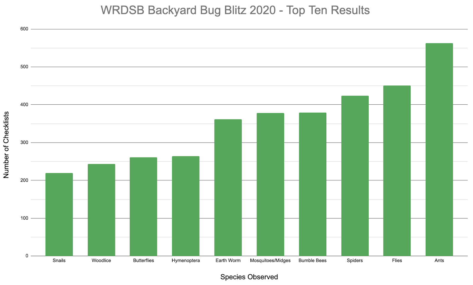
Last week, a lot of WRDSB students and families submitted observations about bugs they saw in their backyards and beyond. Below is a bar graph displaying the top ten most observed species:

Alma says that she notices that a certain bug was observed about twice as often as another one. What pair might she be talking about? How do you know?
If this many total flies were observed across the 5-day bug blitz, about how many, on average, were observed each day? Try to find an approximate one-day average for another species, if you can!
What other conclusions and comparisons could you make from this graph?
Questions and Prompts to Support your Child:
- How do you know the value of each bar in the graph? What do the lines between the labelled scale show?
- If feeling stuck, remember to think about these bar values based on how close they are to “friendly” numbers. With the scale labelled this way, how precisely did the author want us to think about these numbers?
Extensions & Adaptations:
- Take a look at this circle graph of the same data. What does this graph show that our bar graph doesn’t? Why might someone choose to display data in a circle graph?
- Check out the complete listing of results from the Backyard Bug Blitz. How would you have displayed them differently if you created a graph? What type of graph would you use and why?
Categories: Elementary

